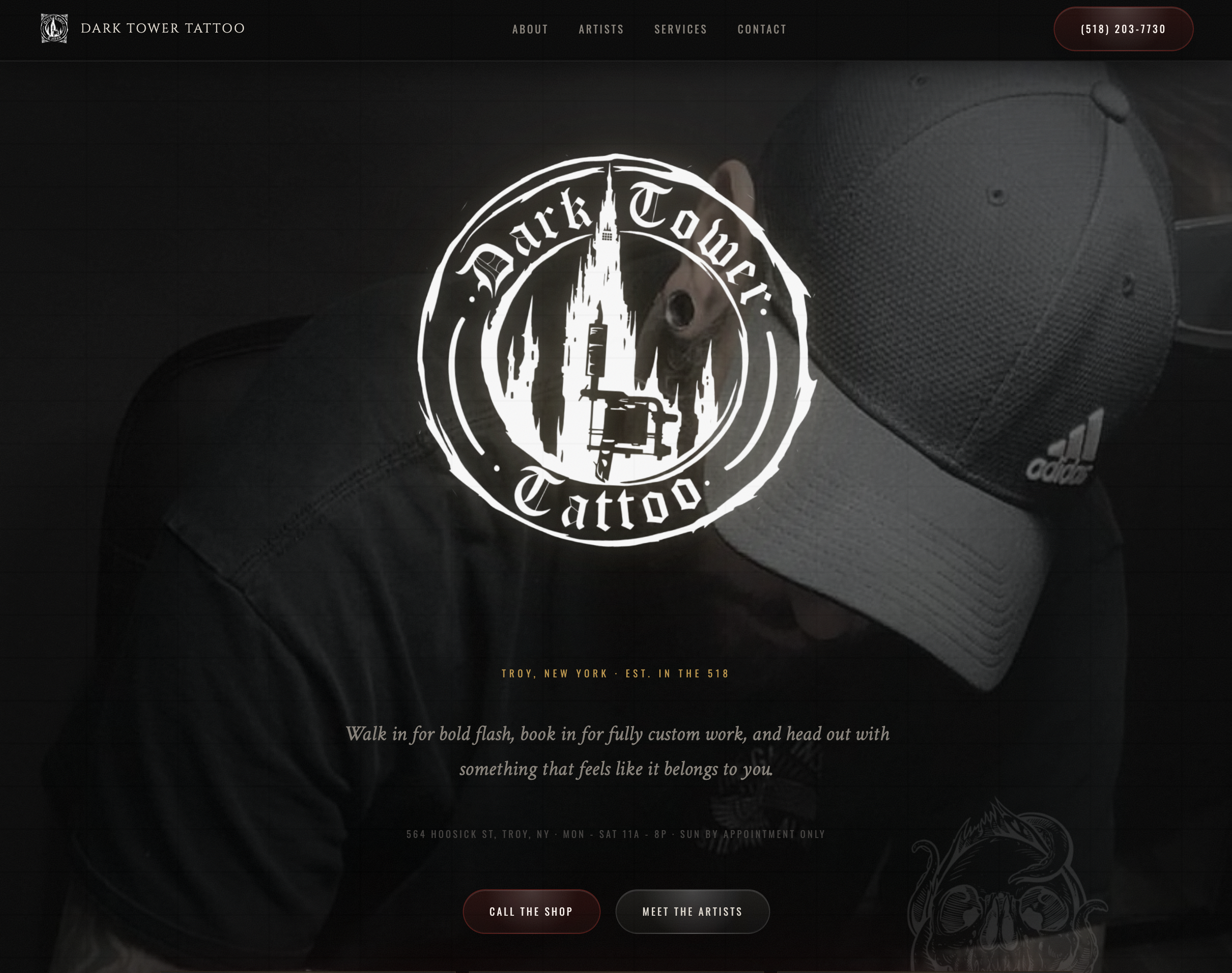
Dark Tower Tattoo
A tattoo studio site built for artist discovery, portfolio browsing, and booking confidence. The darker visual system matches the studio's atmosphere while keeping artists, work samples, and visit details easy to scan.
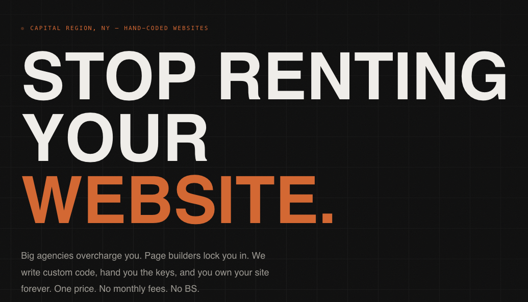
These projects are not just online brochures. They are custom sites built around clear messaging, strong hierarchy, solid mobile behavior, and details that make the work feel finished.
Built To Fit
Every project gets its own look and structure instead of inheriting a generic layout.
Focus
Brand identity, visual hierarchy, and mobile experiences that feel deliberate.
A mix of live launches and coming-soon builds, all designed with clearer structure, better flow, and more care than a starter theme can offer.
A tattoo studio site built for artist discovery, portfolio browsing, and booking confidence. The darker visual system matches the studio's atmosphere while keeping artists, work samples, and visit details easy to scan.
A design portfolio site built to showcase creative work and future service offerings. The restrained layout gives the visuals room to lead while keeping the brand polished, flexible, and ready for case-study growth.
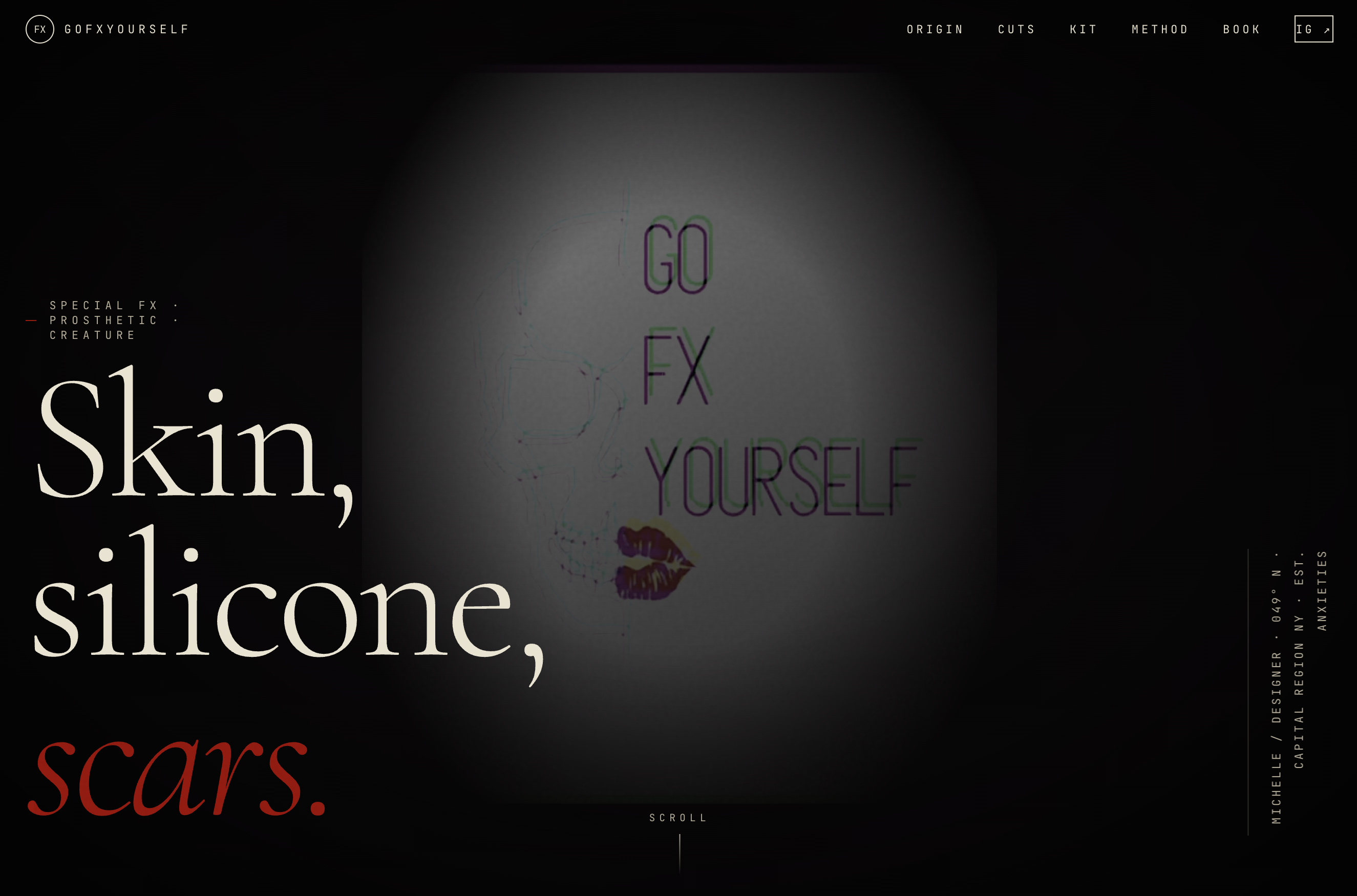
A special-effects makeup site built for film crews, photographers, theatre teams, performers, and private commissions. The cinematic, tactile design mirrors prosthetics, wounds, creature work, and editorial looks without softening the edge of the craft.
A retail brand site built for product discovery, local shopping intent, and a distinctive store identity. The dark-luxury treatment supports the ritual feel of the shop while the navigation keeps the experience grounded.
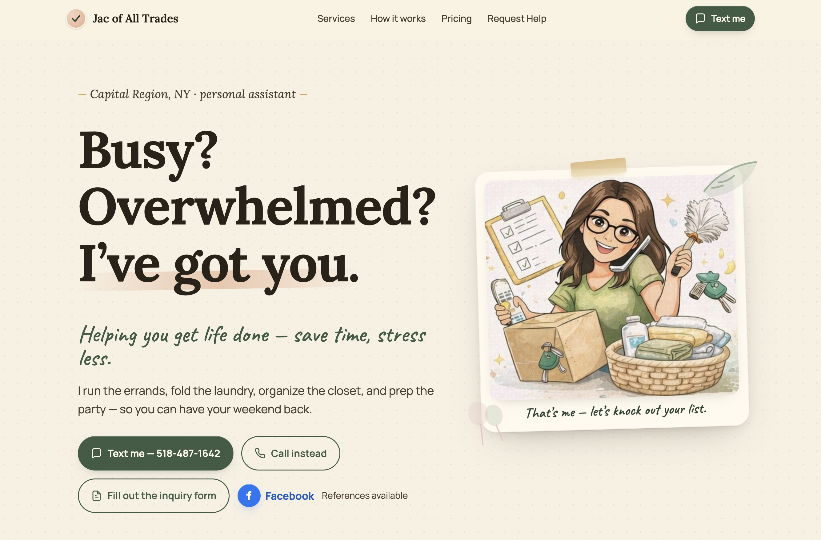
A handyman and home-services site built for quick trust, practical service details, and easy contact. The friendly visual tone fits a neighborhood provider while the page stays direct enough for visitors who just need help scheduled.
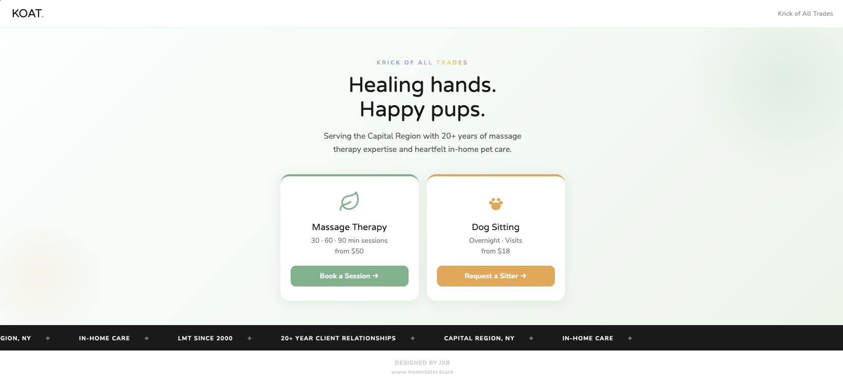
A dual-service local business site built for massage therapy and pet care inquiries. The warm design keeps the brand approachable while the structure separates each offer clearly enough for visitors to choose the right path fast.
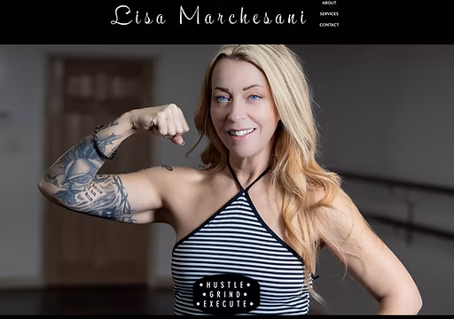
A fitness studio site built for class discovery, trainer trust, and consultation-ready conversion. The energetic design supports movement and motivation while keeping offers, benefits, and next steps readable on mobile.
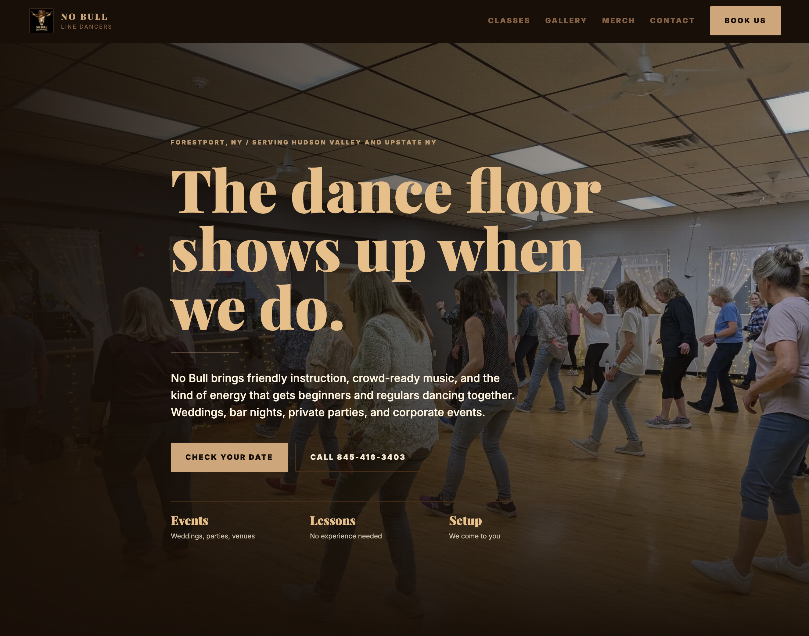
A dance group site built for event visibility, class interest, merchandise requests, and community connection. The high-energy design matches the performers while keeping schedules and contact paths simple.
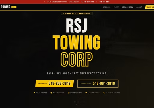
An emergency towing site built for drivers who need help quickly. The mobile-first layout, local service positioning, and direct call-to-action hierarchy match the urgency of roadside decisions.